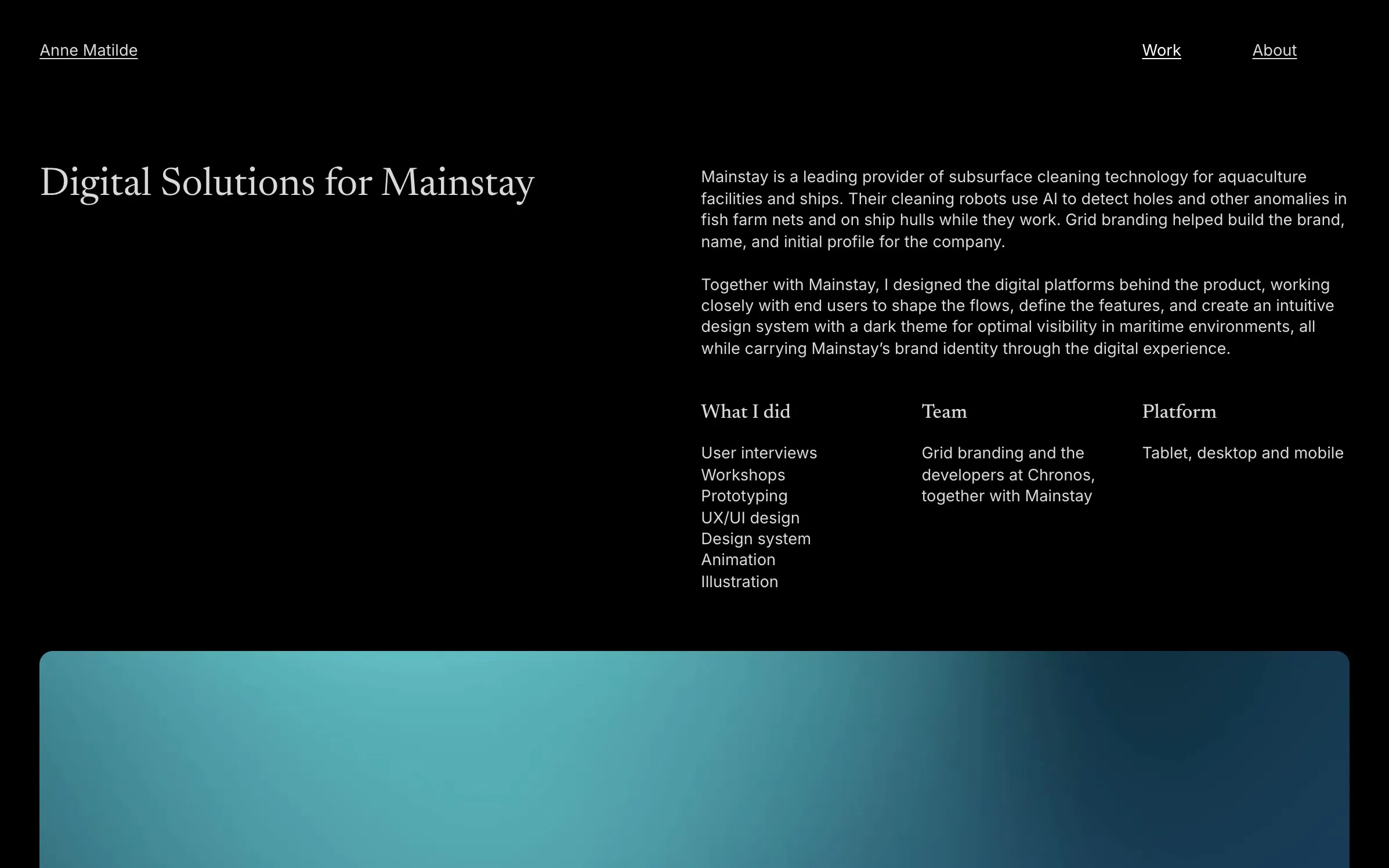
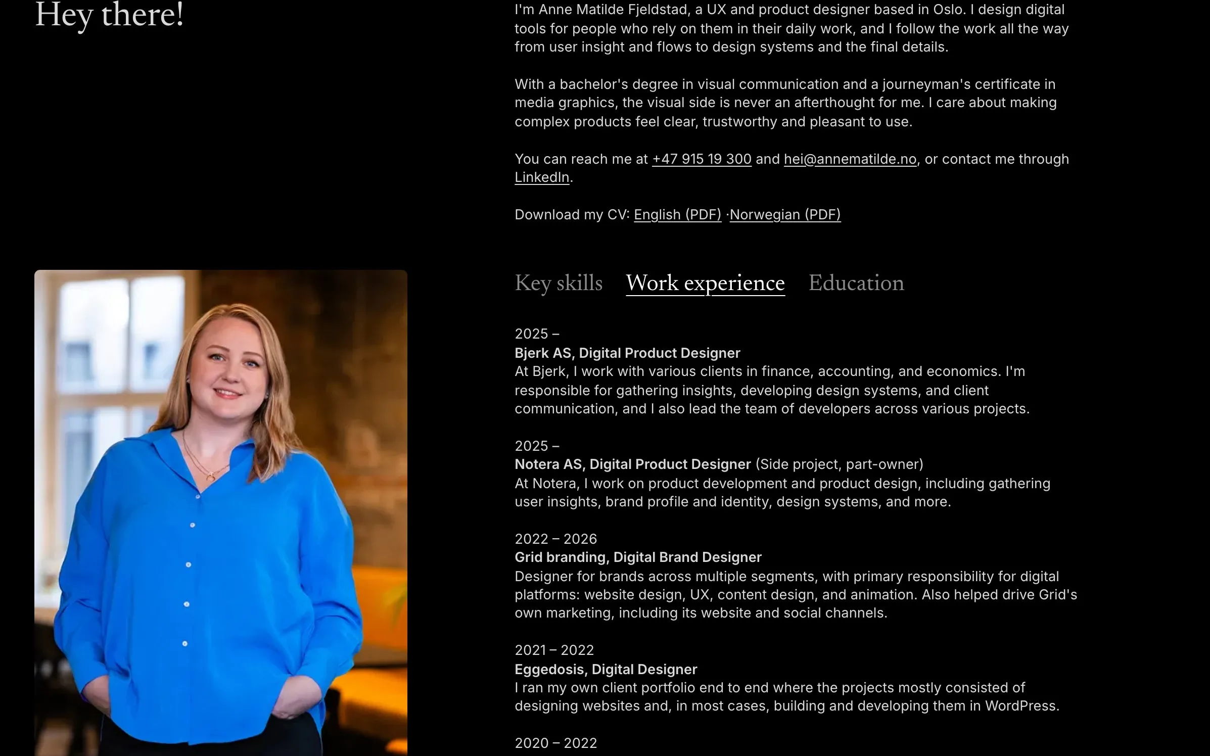
A Design System for My Own Portfolio
- What I did
- Design system
- UX/UI design
- Universal design
- Content design
- Building with AI
- Team
- Me, with Claude Code as AI development partner
- Platform
- Web and PDF
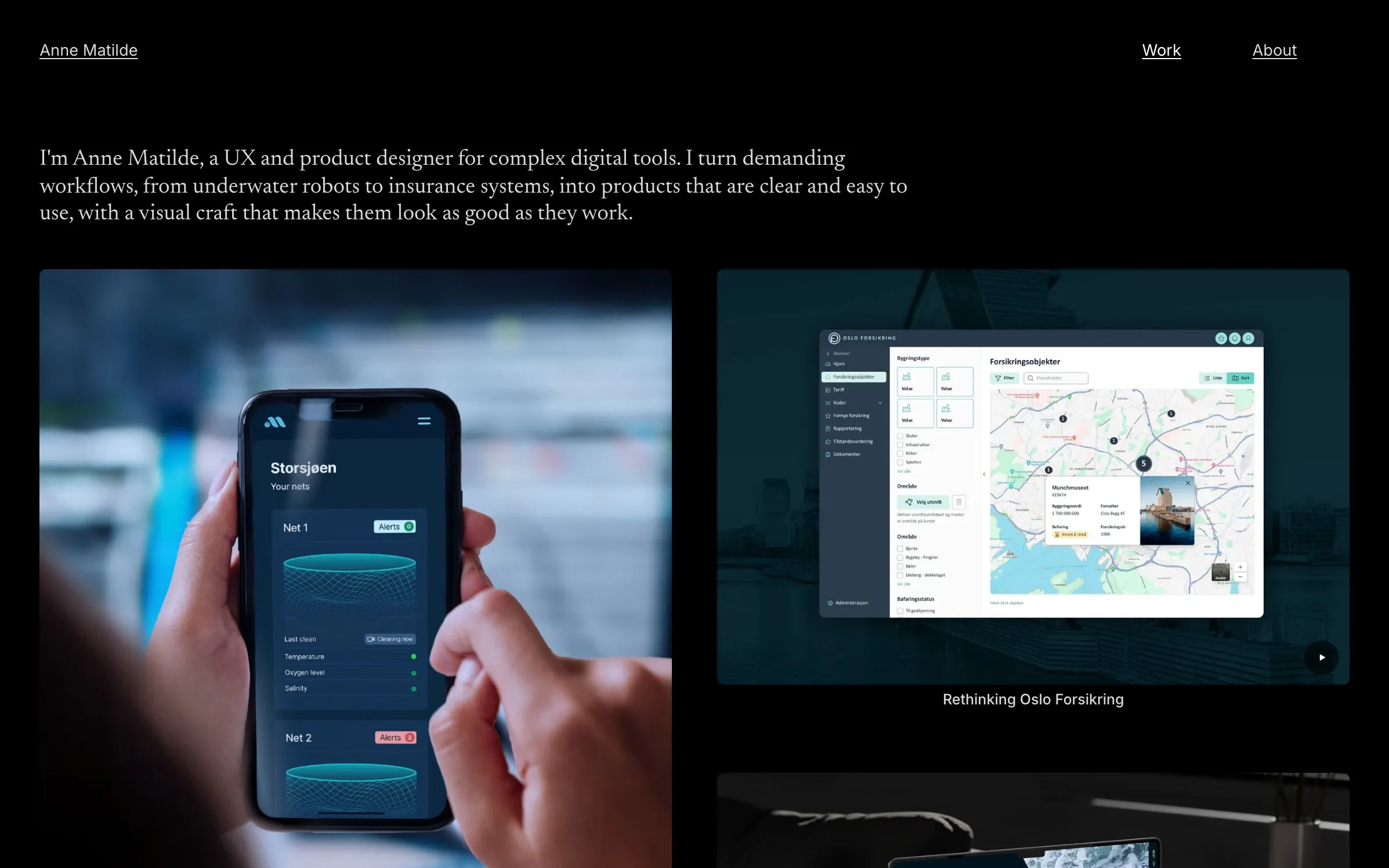
For several years my portfolio lived on Cargo, a website builder. I wanted a site I own and can develop further myself, one that can grow with me as I move further into UX and product design. So I treated it as a small digital product, with its own design system, content model and publishing flow.
I built it together with Claude Code, an AI agent that writes code. I made the design decisions, wrote the principles and reviewed every step, while the agent built, measured and tested along the way.
The problem
A website builder is quick to start with, but hard to keep consistent over time. Every case was laid out by hand, there were no shared rules, and it was difficult to show more of my process. I also wanted full control over accessibility and performance.
Key decisions
Measure first, then systemise
To keep the look I already had, we measured the old site in the browser: type sizes, spacing, columns and how everything scales with the window. The numbers became design tokens and a 12 column grid that every page uses.
Principles that both people and AI can follow
All design principles are written down in one document: typography, colours, spacing, grid, tone of voice and how a case is built. The AI agent reads it before every change, so the site stays consistent when I ask for something new.
Content as structured data
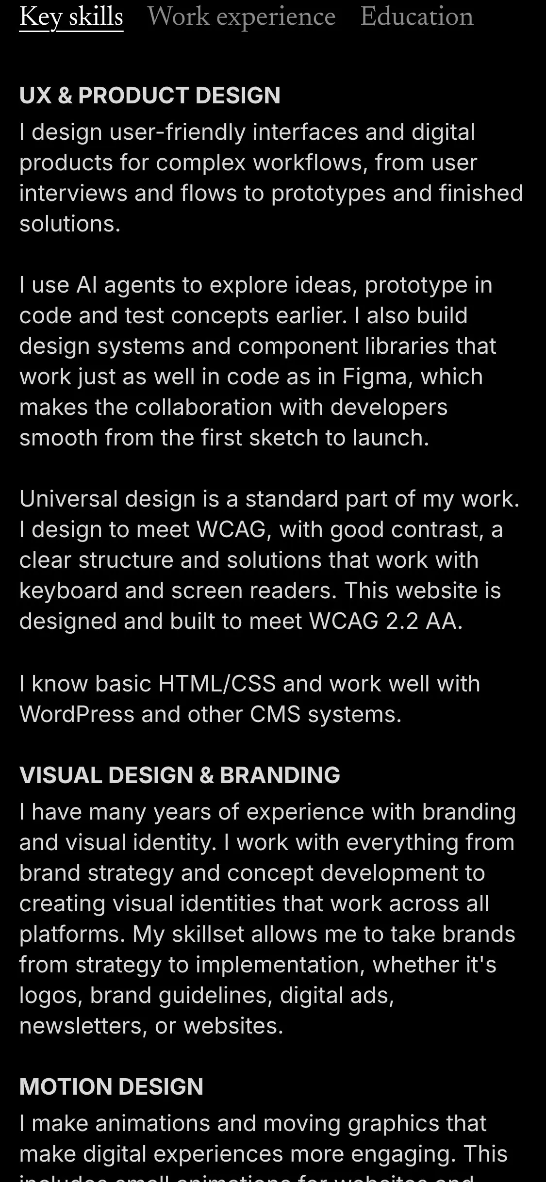
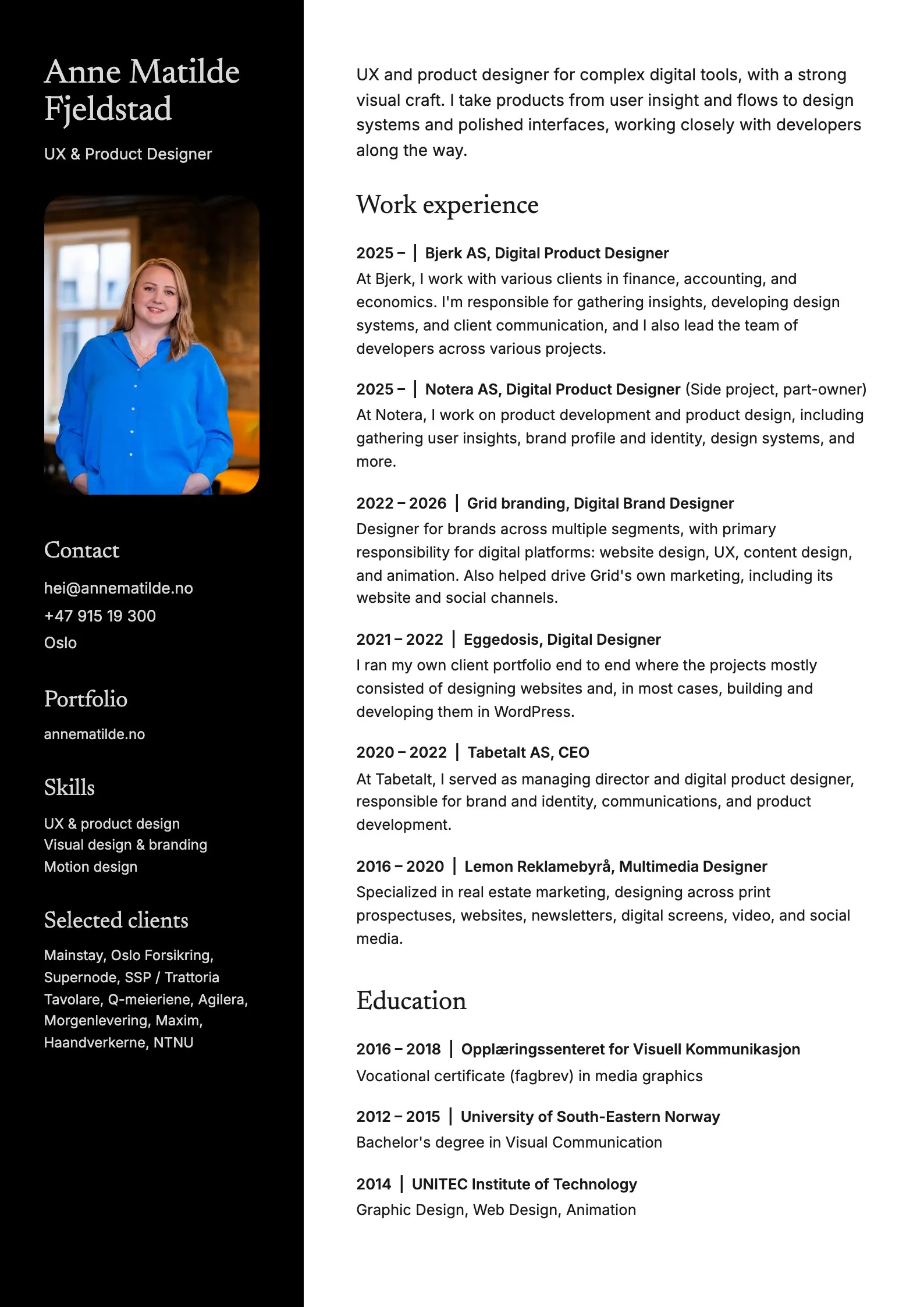
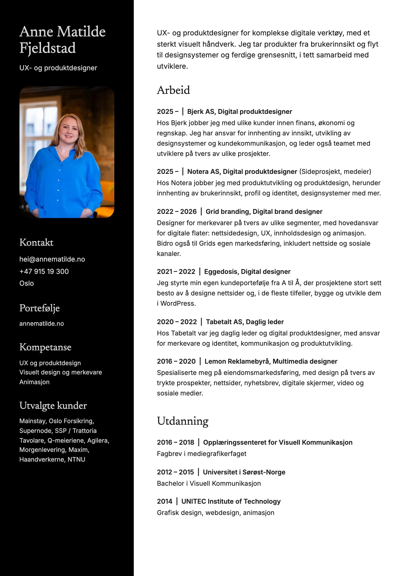
Each case is a Markdown file with its images next to it, and simple conventions decide the layout. Two images on one line become a pair, and three screenshots become a carousel. My CV is one data file in Norwegian and English that feeds both this site and the PDF versions, including tailored versions for each job application.
Accessible by default
The site is designed and built to meet WCAG 2.2 AA: contrast checked against the dark background, a skip link, visible focus, tabs that work with the keyboard, alt text on every image, and videos that can be paused and respect reduced motion.
When the rules are written down, the site stays consistent.
Testing and iterating
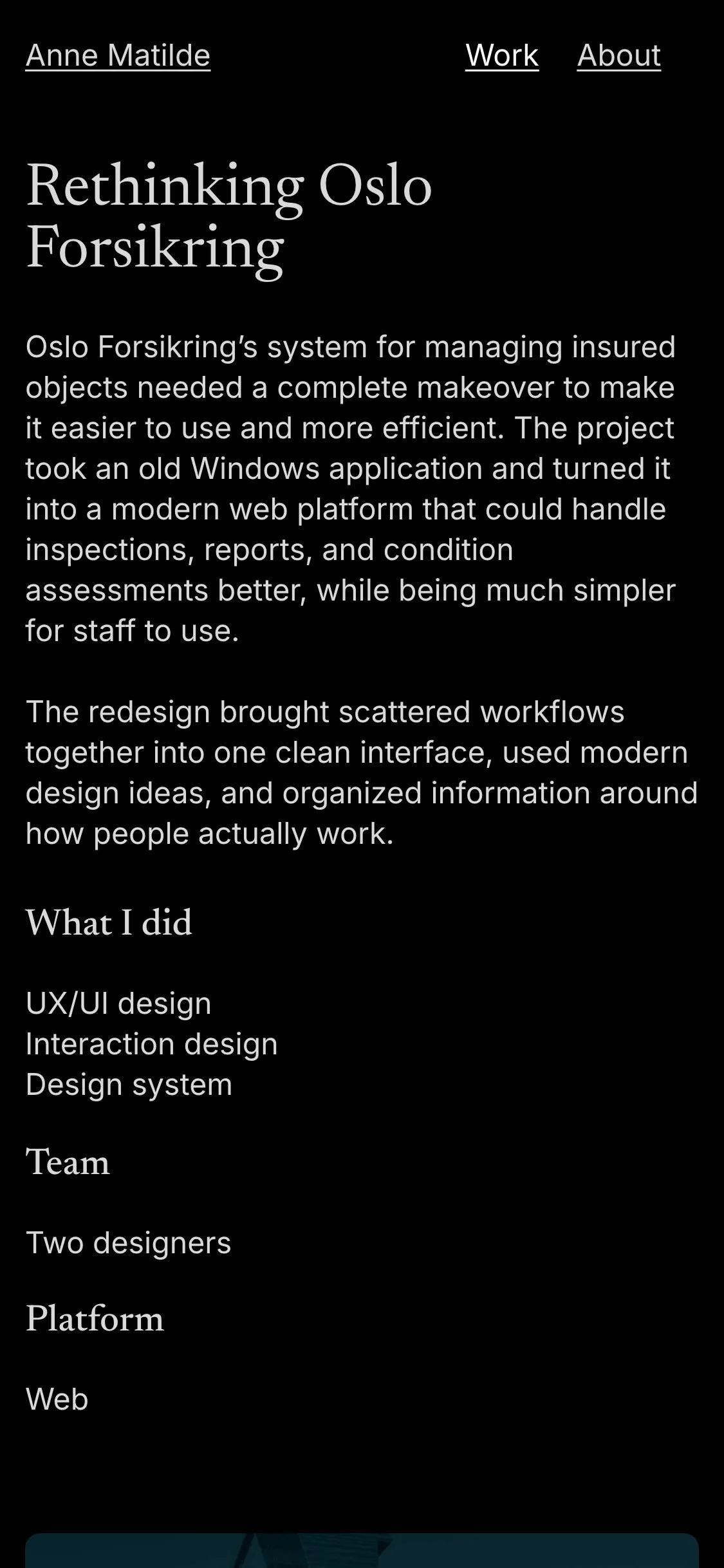
I reviewed every change locally on desktop and mobile before anything was published. Some ideas did not survive. Centred text sections clashed with the left aligned captions, so all text now lines up with the image columns. A front page split into separate sections for UX and brand felt messy, so the cases went back into one list, with UX work first.
The solution
A fast, static website where images are optimised automatically and videos only load when they are needed. It is hosted on Dina, a platform made by a colleague, and every old Cargo address redirects to the right new page.