A New Visual Identity for Møller Bil
- What I did
- Creative lead
- Concept
- Visual identity
- Graphic design
- Team
- Grid branding (two designers and an advisor), together with the team at Møller Bil
Møller Bil is one of Norway’s largest car dealers, with almost 100 years of experience. At Grid branding I was the creative lead on the redesign of their visual identity, responsible for the creative work, together with another designer, an advisor and the team at Møller Bil.
The goal was to position Møller Bil as both competent and caring: the helpful expert. The new brand promise is «Møller Bil gir hjelp til en bekymringsfri bilhverdag», help for a worry-free everyday life with your car.
The background
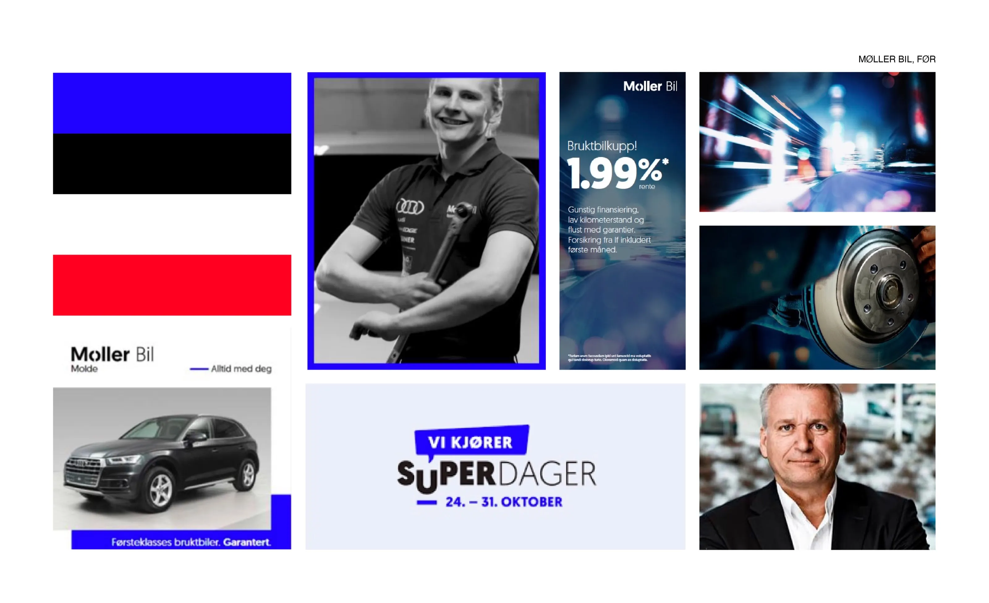
Research by Perceptor showed a gap between what customers need and what car dealers deliver. Many were unsure if they could trust the advice they got, and worried about getting help when something goes wrong.
«Can I trust that the advice I get is in my best interest?»
The idea
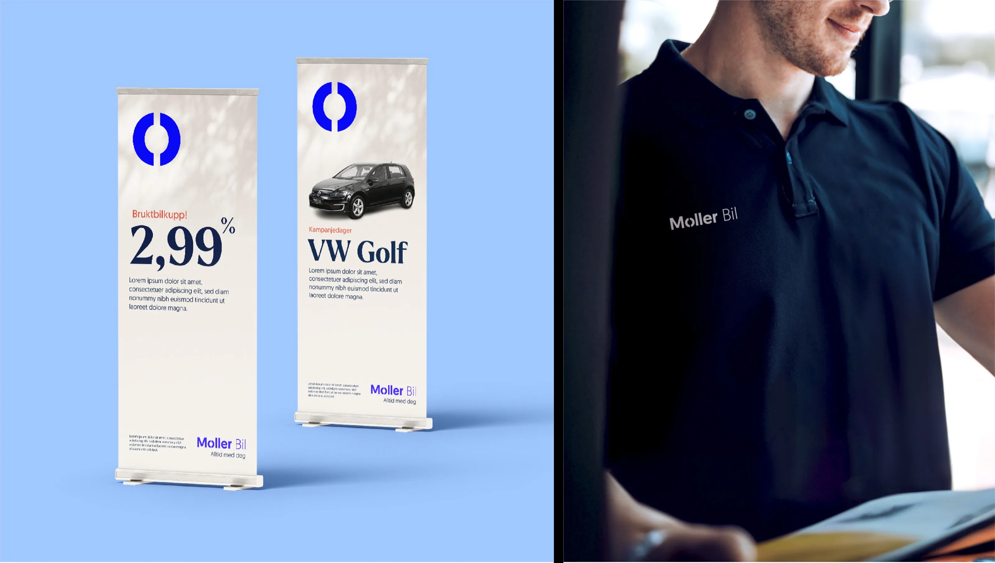
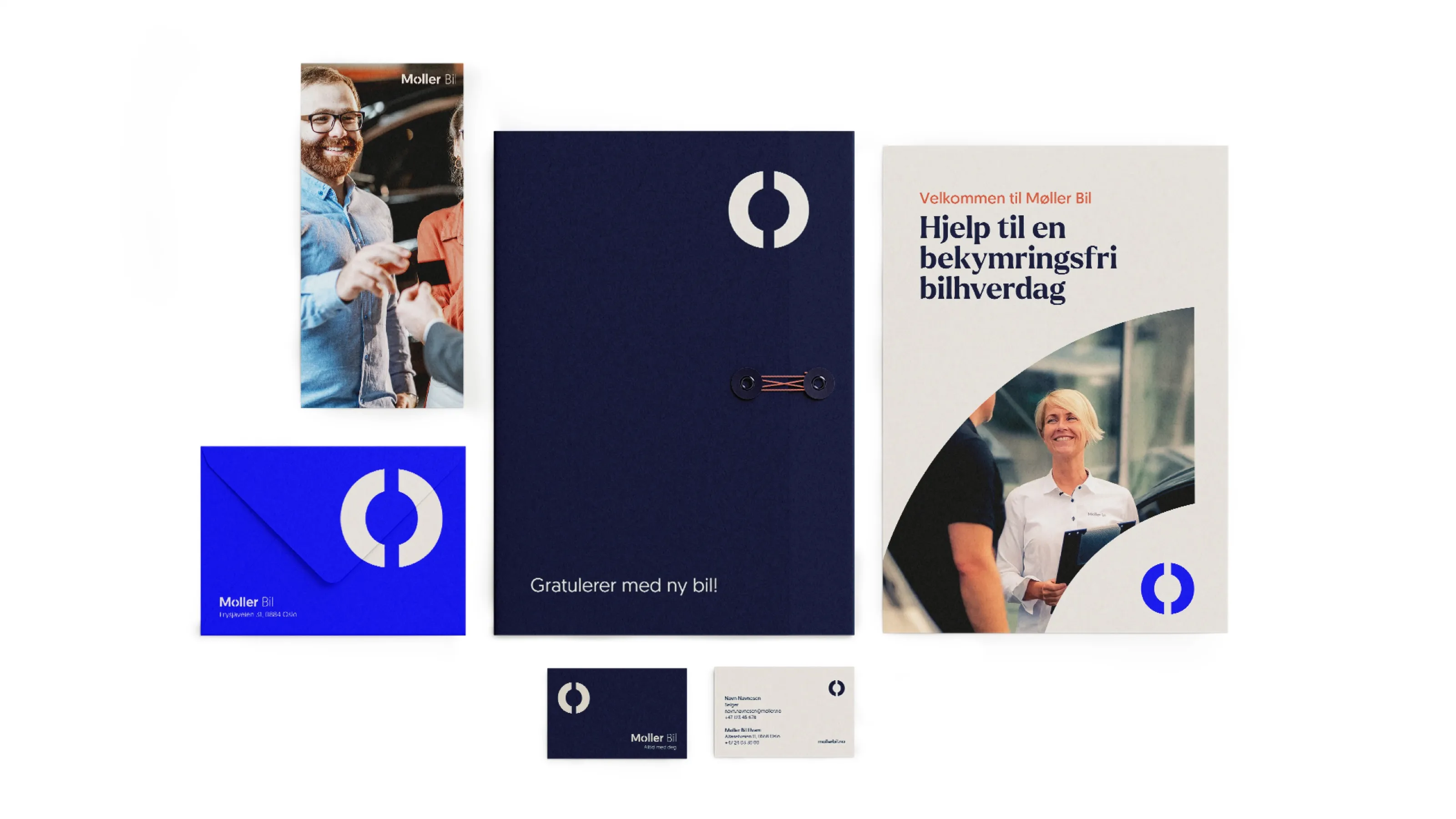
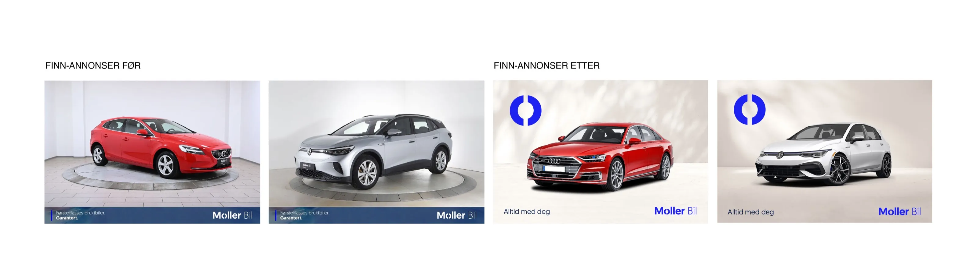
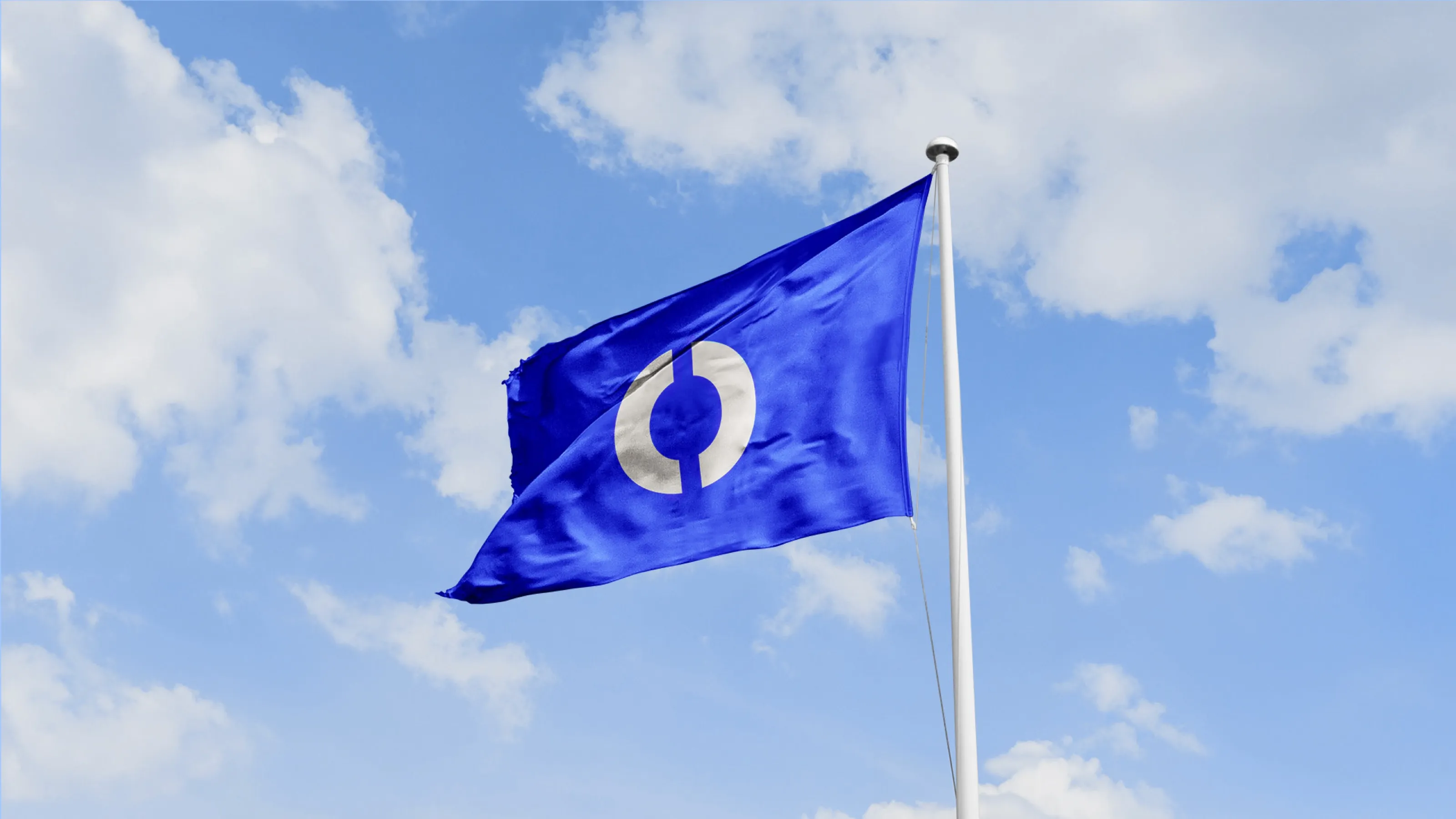
The Ø in Møller became the core of the identity. It works on its own as a brand marker, and in moving media it turns 180 degrees into a smile, connecting the symbol directly to the promise of a worry-free car life. Photos are cropped with the shape of the Ø, so the symbol is present at every touchpoint.
Colours and typography
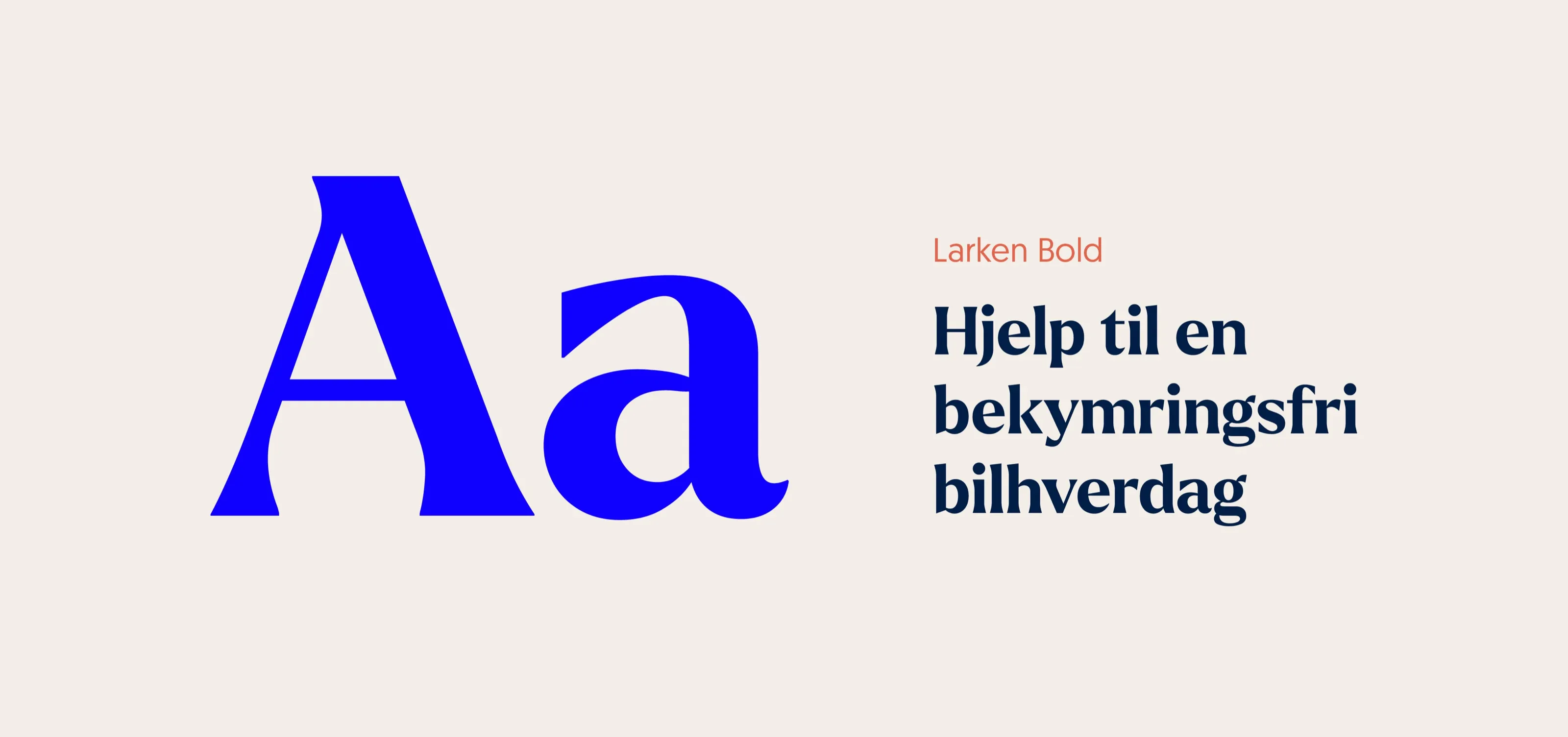
The established blue was expanded with darker and lighter blues, beige and warm coral, balancing authority with warmth. The main typeface was kept, and a distinctive display typeface for headlines adds a more personal voice.