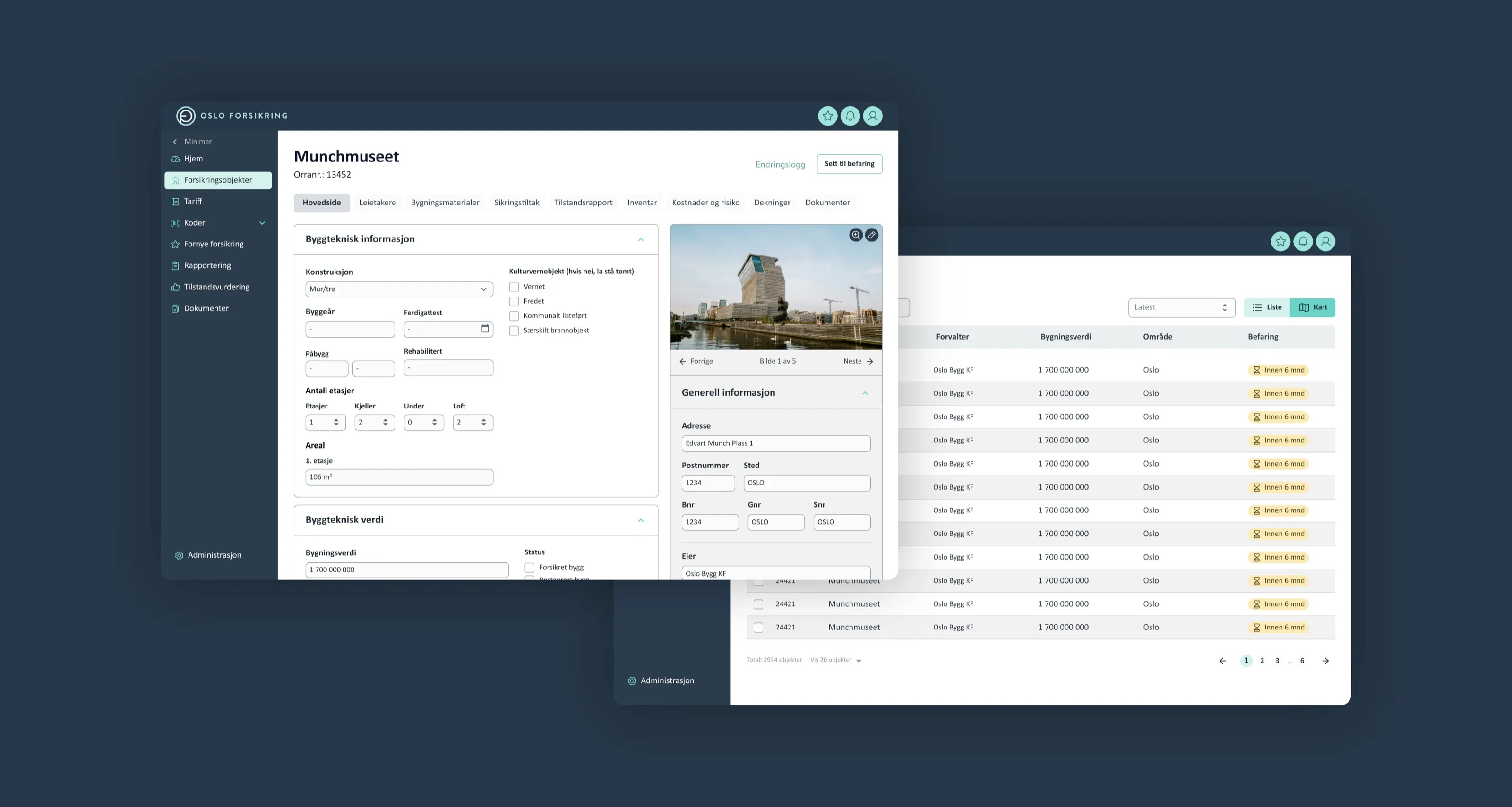
Rethinking Oslo Forsikring
What I did
- UX/UI design
- User research
Oslo Forsikring’s system for managing insured objects needed a complete makeover to make it easier to use and more efficient. The project took an old Windows application and turned it into a modern web platform that could handle inspections, reports, and condition assessments better, while being much simpler for staff to use.
The redesign brought scattered workflows together into one clean interface, used modern design ideas, and organized information around how people actually work. The result turned a messy, slow process into a smooth workflow where staff can see everything they need and get their work done from one platform.
The problem
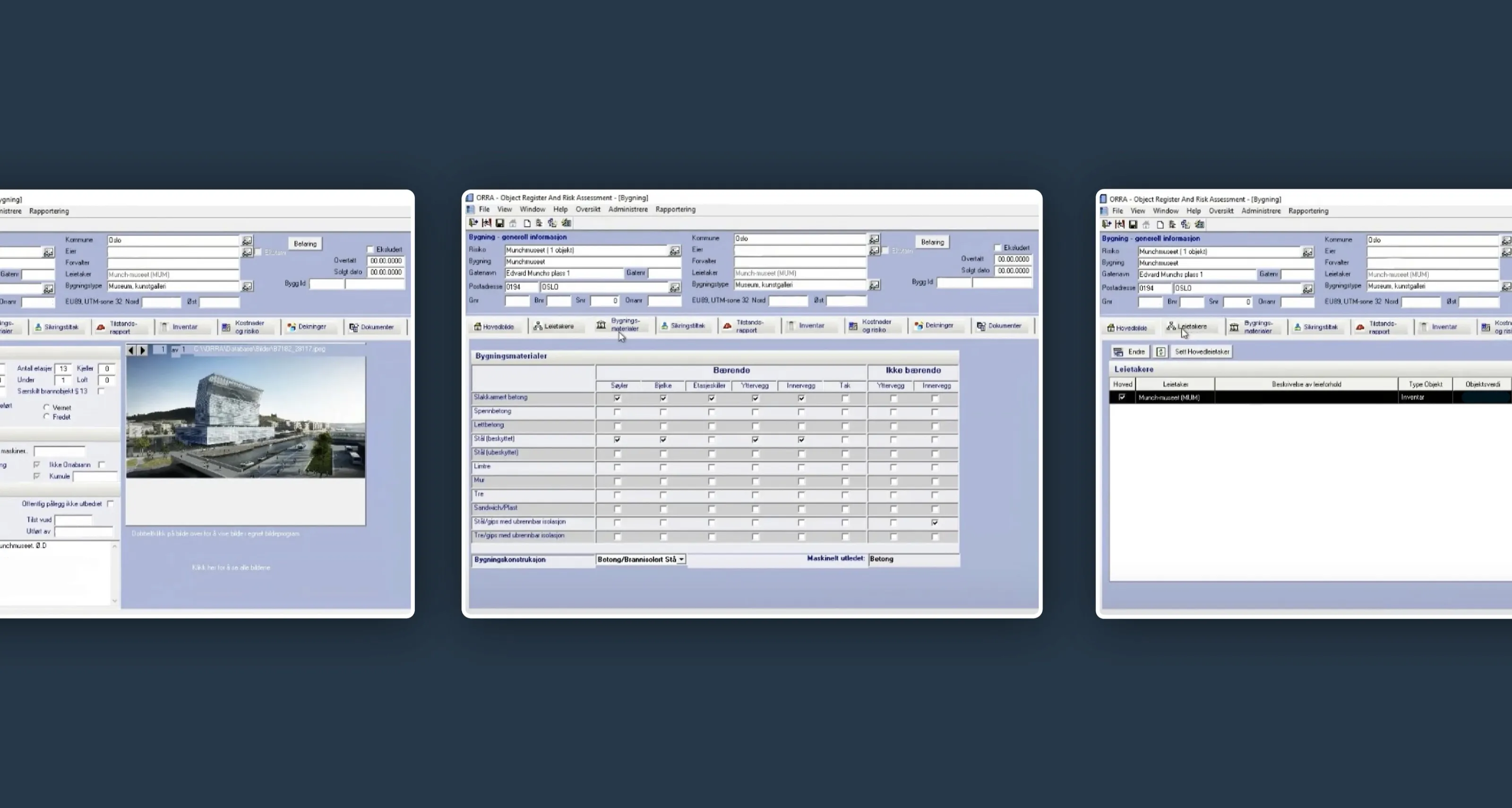
The old system was hard to use and slowed work down. Information was poorly organized, spread across multiple scattered windows, and the interface looked outdated. Staff had to click through a lot of different boxes and windows just to get simple tasks done.
The solution
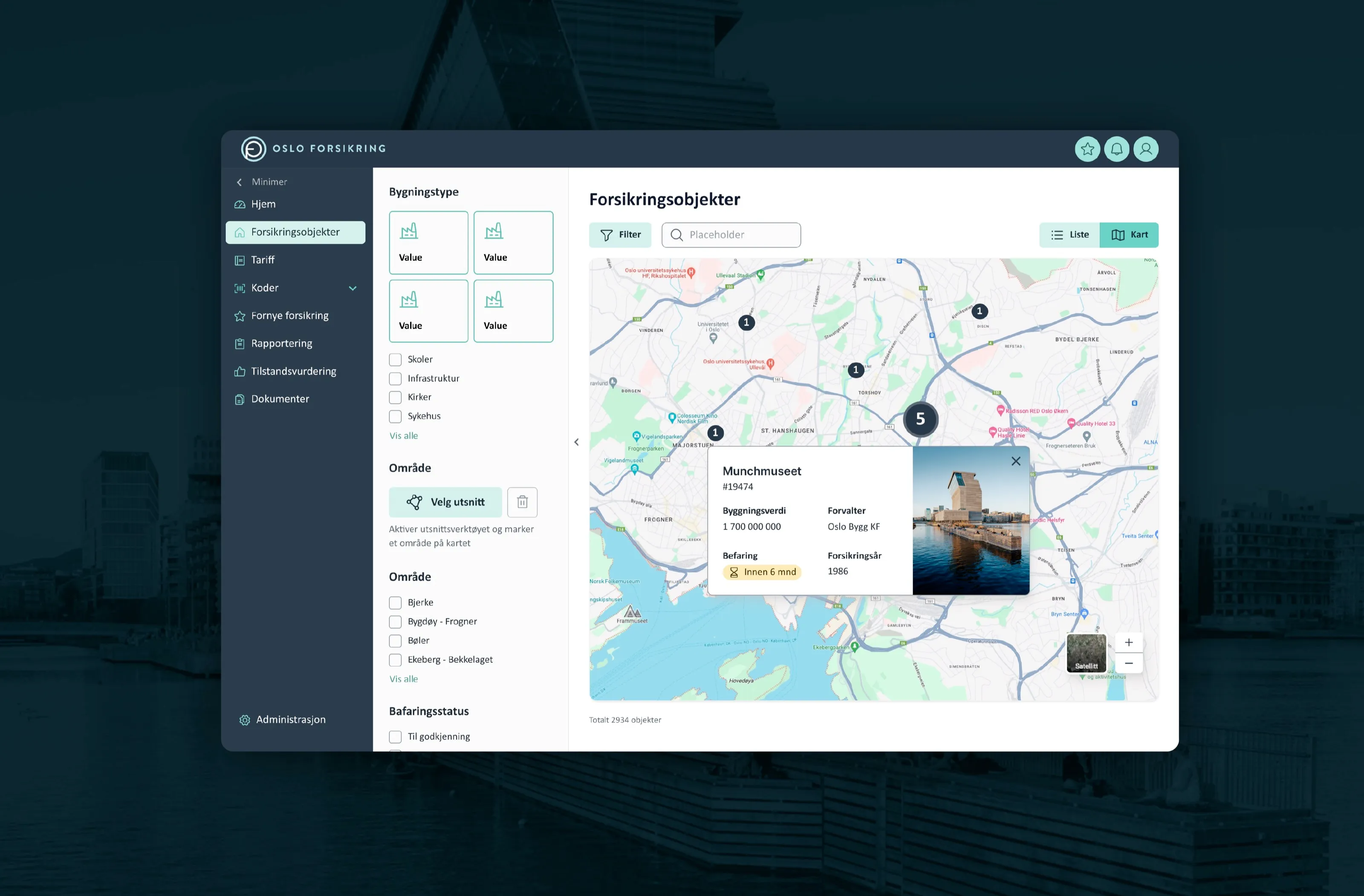
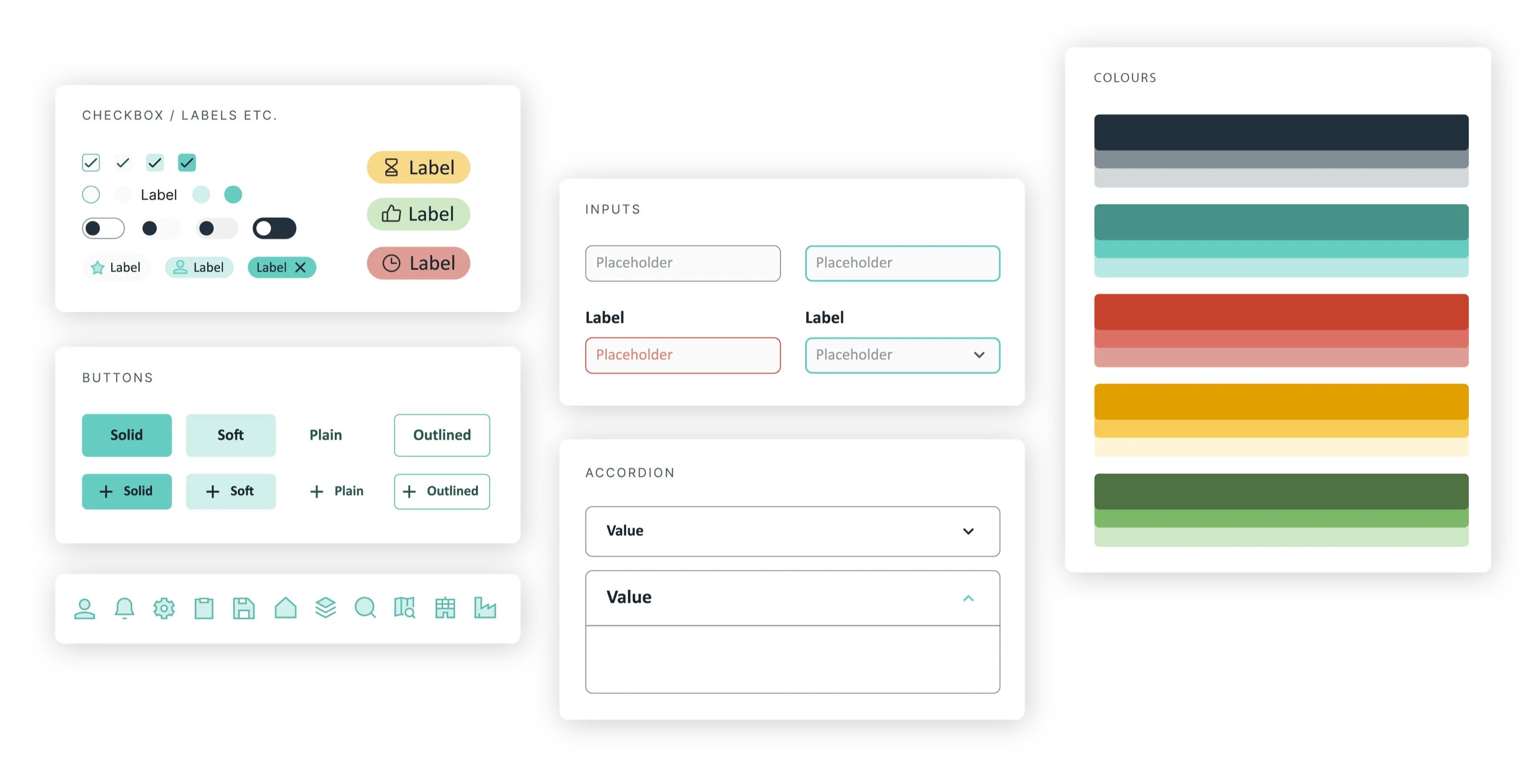
A modern web interface built around the way staff actually work: managing insured objects like buildings and bridges, carrying out inspections, and filling in condition assessments. We tailored an established component library (MUI) to fit Oslo Forsikring, with a clear left-hand menu, accordions that let users work step by step, and both map and list views with filtering so they can quickly find every object within a given radius after an incident like a fire or water leak.