Distinctive Packaging Design for Maxim
- What I did
- Concept
- Design
- Brandbook
- Animation
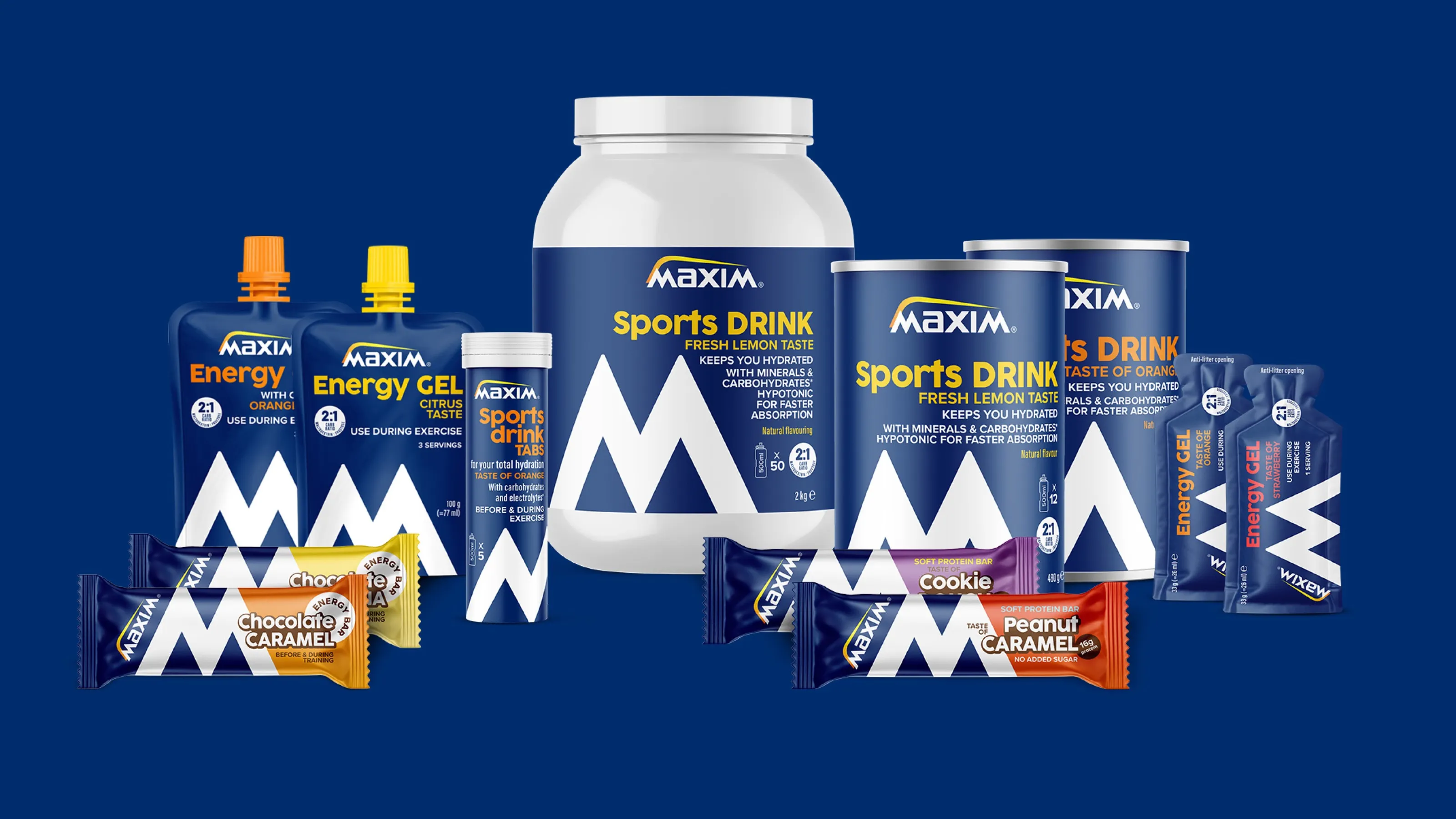
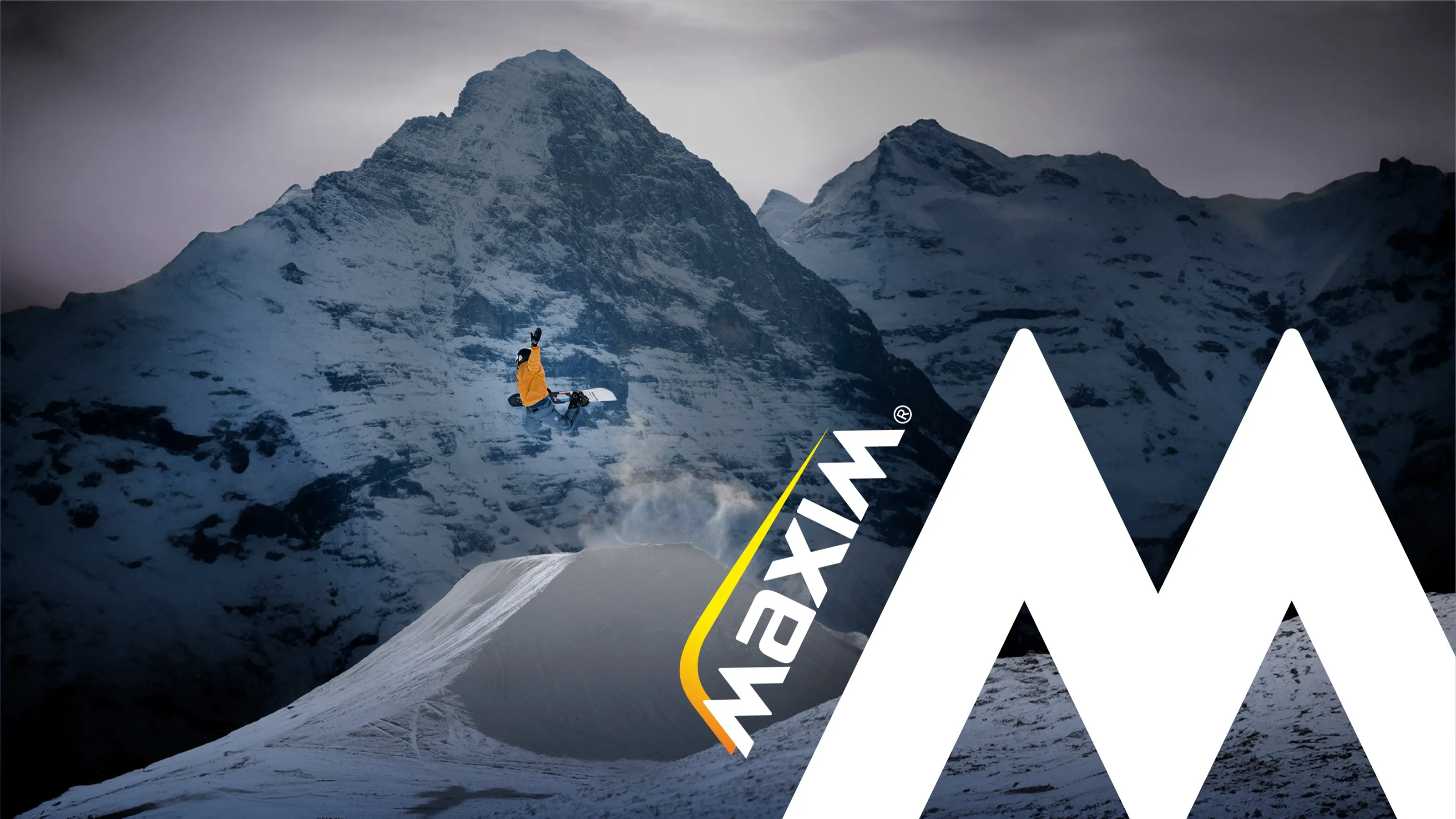
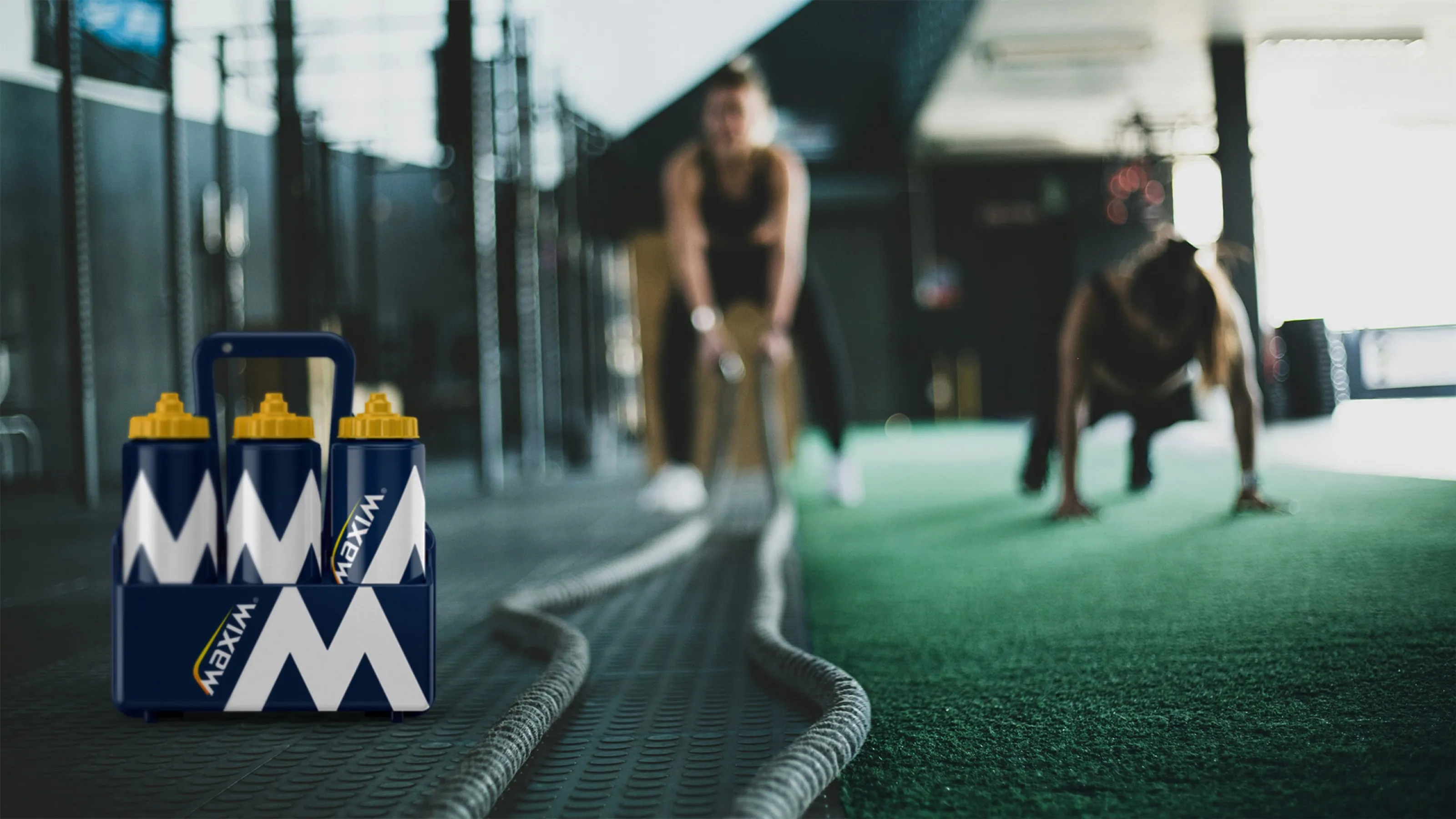
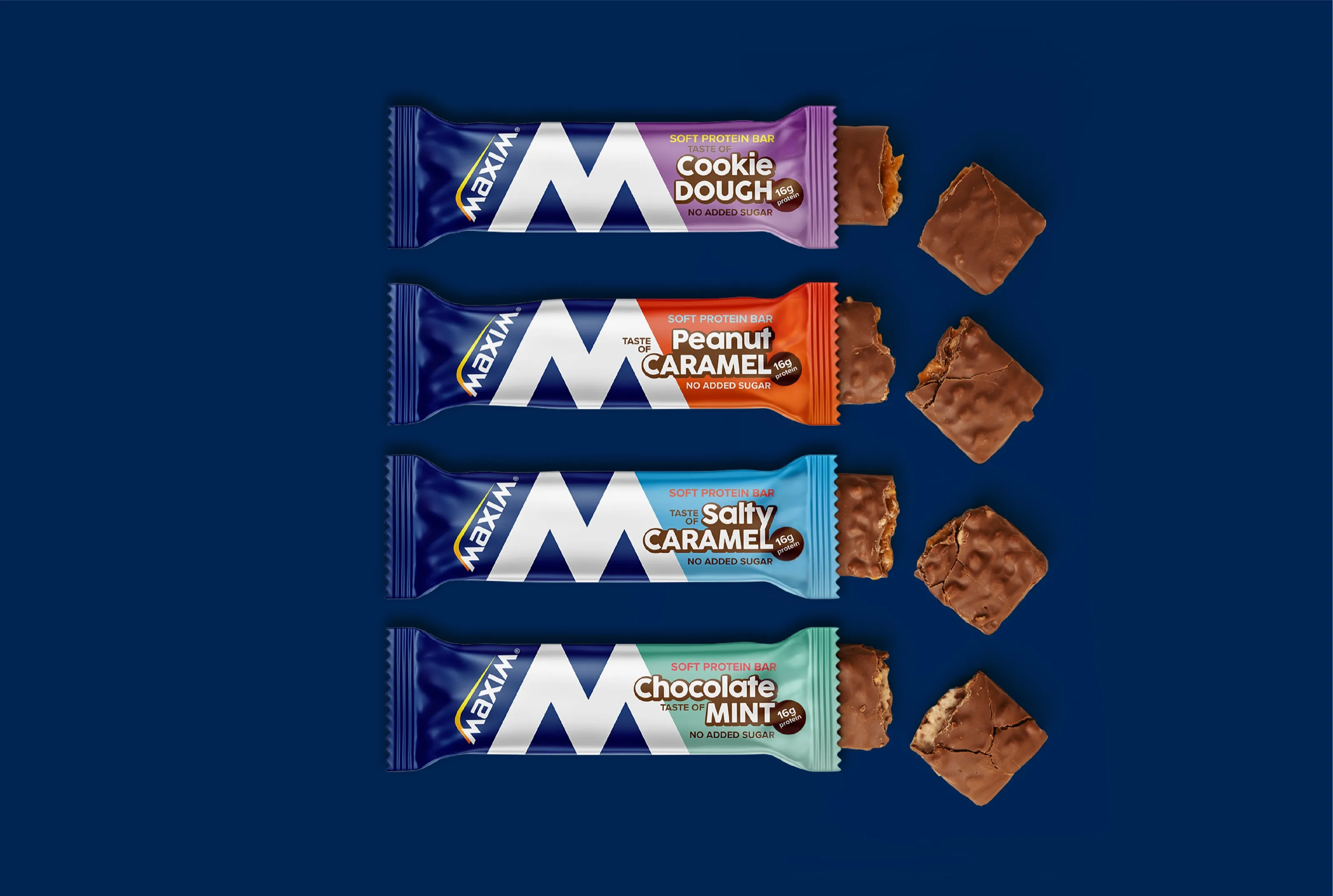
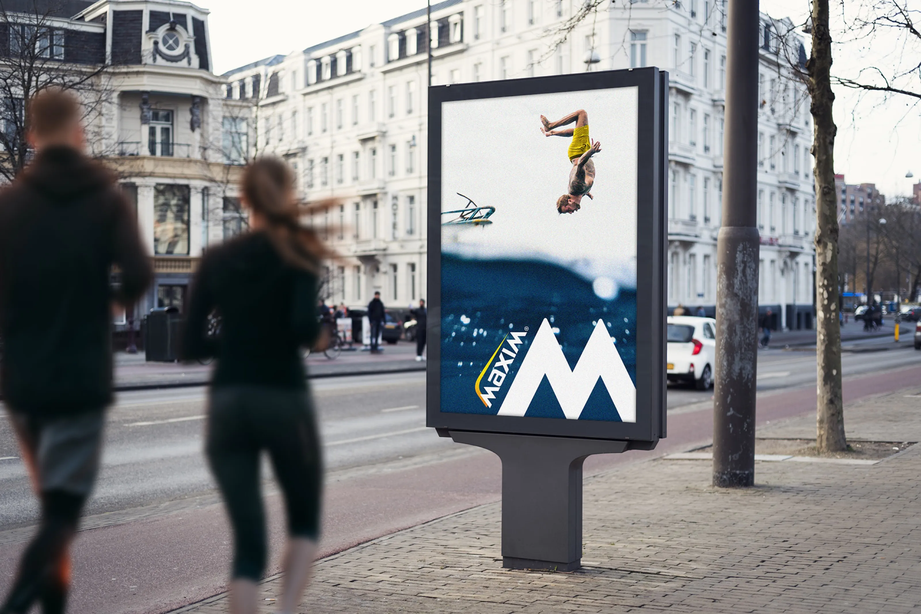
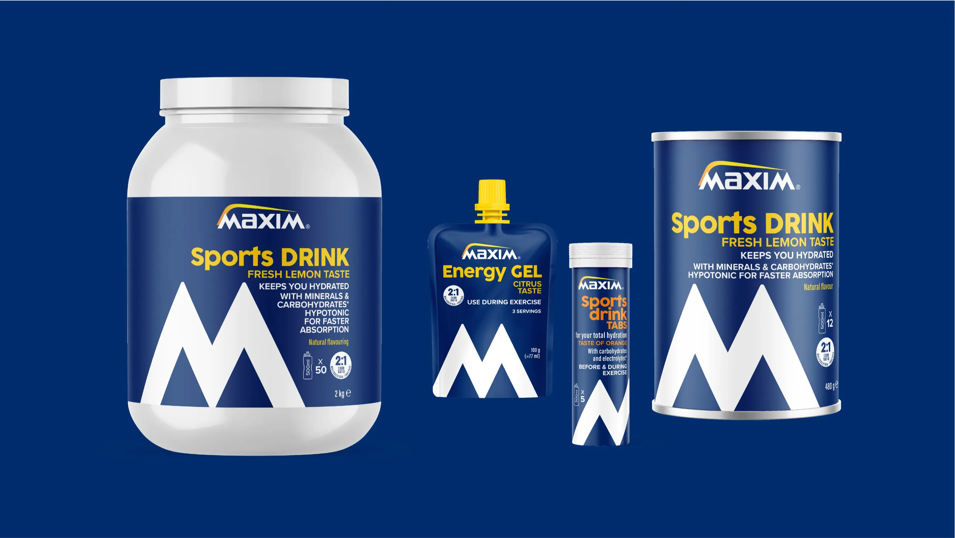
As co-designer on the redesign of Maxim, a pioneering Nordic sports nutrition brand, I helped create a distinctive visual system that strengthens their shelf presence while unifying their extensive product portfolio. The new design architecture features a bold white ‘M’ symbol against Maxim’s iconic blue, creating strong brand recognition across both digital and physical touchpoints.
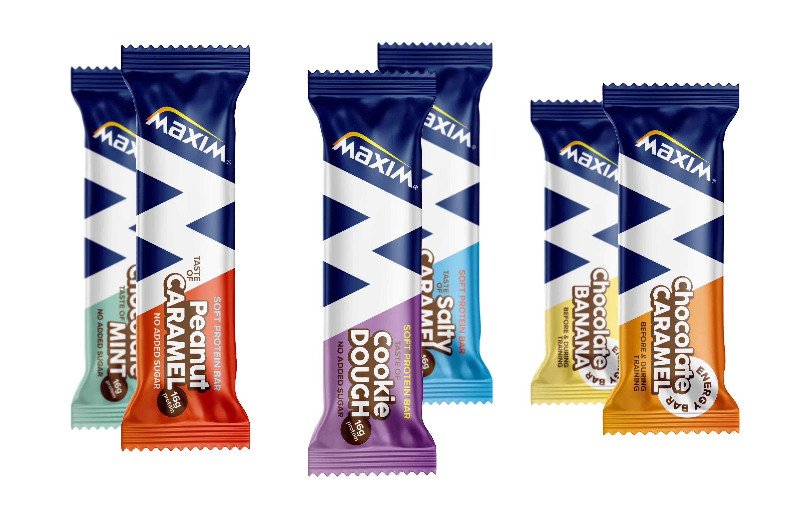
Our team developed a flexible design system that adapts across six product categories and three sub-brands, balancing performance messaging with taste appeal. For example, Soft Protein Bars emphasize indulgence, while Energy Gels highlight functionality. The refreshed identity maintains Maxim’s international trademark elements while modernizing the brand for new market expansion.